Retail
How Doers Get More Done
Home Depot · 2025
A high-energy orange deck. Home Depot’s unmistakable orange blocking, stencil logo, and pro-customer photography drive a scale-and-share story.
Design System
Color Palette
HD Orange
#F96302
Primary brand / accent
Ink
#231F20
Primary text
Warm Gray
#7A7572
Secondary text
Paper
#F7F5F2
Panels
White
#FFFFFF
Backgrounds
Typography
- Headings
- Stencil display for brand moments (logo heritage) with Helvetica Neue Condensed Bold headlines; similar to Oswald
- Body
- Helvetica-family sans at regular weight
- Notes
- Orange headline blocks with white type; black for dense data sections.
Visual Style
EnergeticIndustrialPro-focusedBold
Layout
Orange section dividers, white data slides, and full-bleed aisle and jobsite photography.
Imagery
Pros, aisles, tools, and supply chain photography with high saturation.
Charts & Data
Orange and gray bars with bold numerals; simple share-gain walk charts.
Frequently Asked Questions
- What colors does Home Depot use in its presentations?
- Home Depot's Investor Presentation (2025) uses a 5-color palette: HD Orange (#F96302) for primary brand / accent, Ink (#231F20) for primary text, Warm Gray (#7A7572) for secondary text, Paper (#F7F5F2) for panels, White (#FFFFFF) for backgrounds.
- What fonts does Home Depot use in its slides?
- Headings: Stencil display for brand moments (logo heritage) with Helvetica Neue Condensed Bold headlines; similar to Oswald. Body: Helvetica-family sans at regular weight.
- What is the presentation design style of Home Depot?
- The deck's visual style is energetic, industrial, pro-focused, bold. Orange section dividers, white data slides, and full-bleed aisle and jobsite photography.


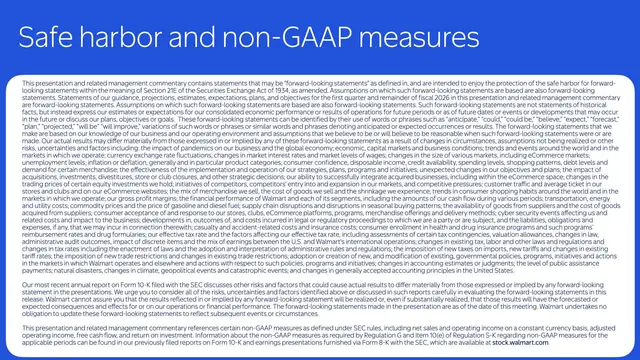
Recreate this look in Plus AI
Download the design spec and generate a fully styled deck in minutes.